
Most web design case studies open with a six-week discovery phase and a mood board. This vending machine website design case study opens with a folder containing exactly three things: one flyer, one logo file, and six phone photos of installed machines. That was everything Gotham Refreshments LLC — a vending operator serving Staten Island, Brooklyn, Manhattan, and northern New Jersey — had to hand over. Three days later, gothamrefreshmentsllc.com was live: 25 pages, a six-step lead quiz, and a clean pass through our automated pre-launch audit.
I’m Bobby Mac, founder of Techlancer — a digital marketing and engineering firm in Lombard, Illinois, working with service businesses since 2016. The people who build our sites are the people who run the campaigns. Every claim below is checkable on the live site — and the ranking log at the bottom of this page gets updated in public as the site climbs.
What do you start with when the client has almost nothing?
Gotham Refreshments places glass-front snack machines, BevMax beverage merchandisers, and combo machines at businesses at no cost to the host — free delivery, installation, weekly restocking, and repairs, with the operator earning from product sales. The machines take cards, Apple Pay, and Google Pay alongside cash, inventory is monitored remotely, and there’s no contract requirement and no minimum employee count. A genuinely strong offer, with no website behind it.
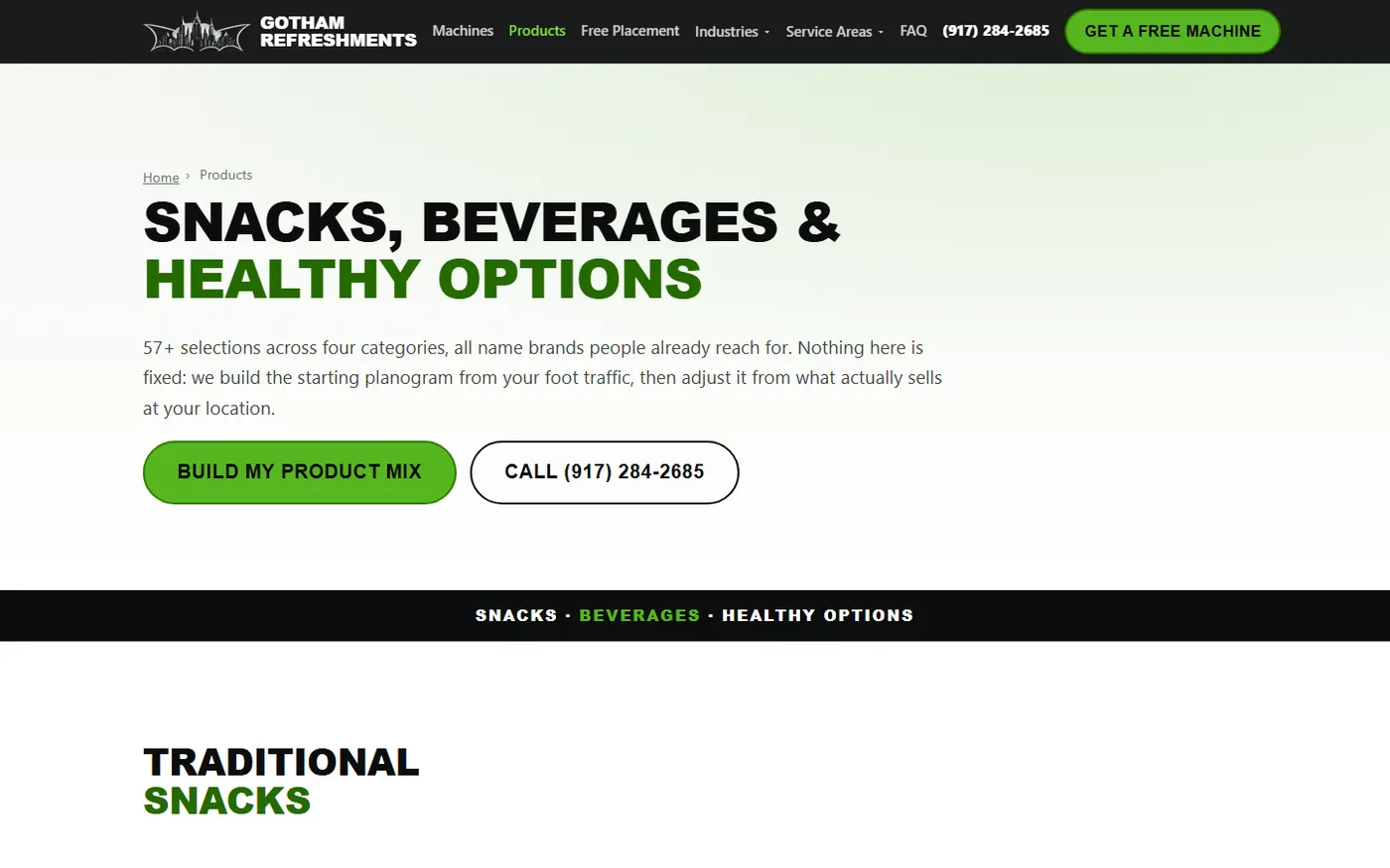
Building a small business website from scratch usually stalls on content — the developer waits on copy, the owner waits on the developer, and weeks pass. The fix here was treating the flyer as a spec. It supplied the four service pillars, the five industry verticals, the six reasons-to-choose, the product list, and a pricing guide that survives verbatim on the products page: $1.00–$2.25 for traditional snacks up to $2.50–$4.00 for specialty coffee. The six phone photos were cleaned up and put to work as the site’s real imagery — because a genuine installation photo beats stock photography in every context that matters.
Everything else — every page of copy, the brand system, the product catalog — was produced from those three inputs plus the owner’s answers to our questions.
How do you build vending machine branding from one flyer and a logo?
Vending machine branding sounds like an oxymoron until you’re the operator whose proposal gets compared against two competitors’. Gotham’s flyer already had a look: near-black backgrounds, a signature green, and the tagline “Smart Machines. Better Experiences.” So the site’s brand system was derived rather than invented — night-black (#0b0d0c) and that green (#57b520) as the palette, self-hosted Inter as the typeface, and the flyer’s own taglines as the hero copy.
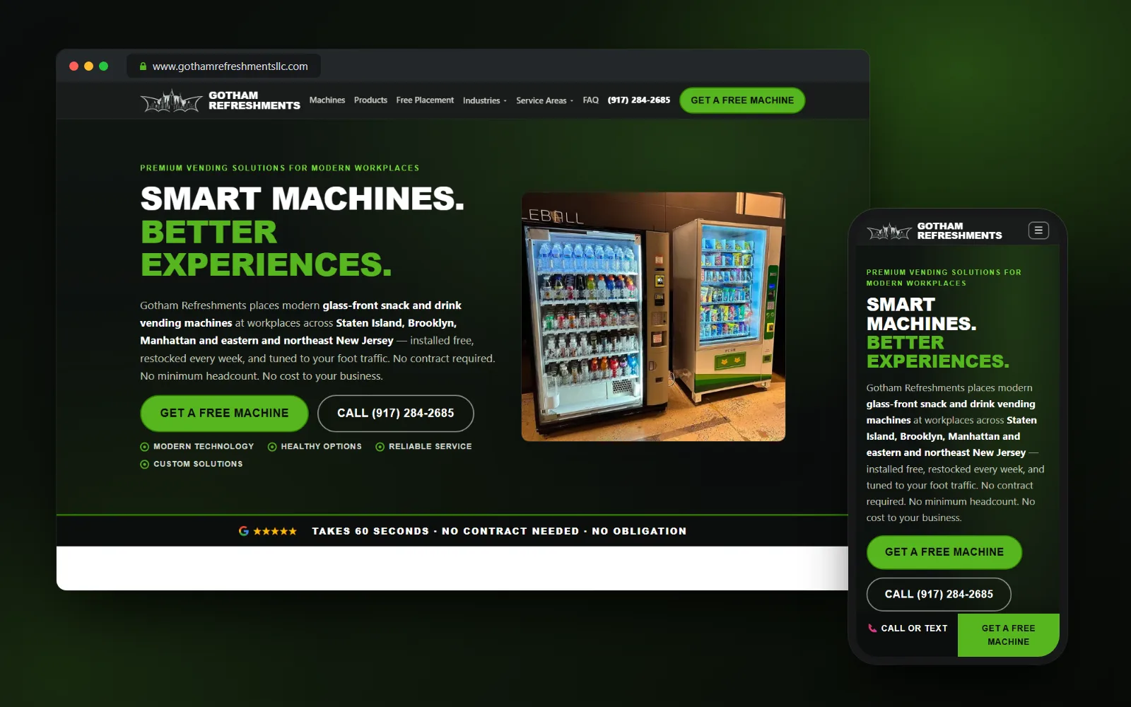
The vending machine logo was the interesting problem. The client’s file was silver artwork on a solid black field — fine on a flyer, useless on a website that needs it on headers, footers, and light backgrounds. Rather than commission a redraw, we reprocessed that one file into a complete identity set: a clean wordmark that works on any background, the favicon, and the social-share card that appears when the site gets texted or posted. One file in, a whole brand system out — no waiting on a designer.
The product catalog got the same treatment at scale: 57 named products, each with real, properly licensed brand imagery — assembled without the client lifting a finger.
Why claim a smaller service area than you could?
The site covers Staten Island, Brooklyn, and Manhattan, plus Jersey City, Hoboken, and Newark on the New Jersey side — six city and borough pages generated from one dynamic-route template, rolled up under two New Jersey hub pages. Deliberately not all five boroughs. Not Long Island.
That restraint is deliberate. Claiming ground the route doesn’t cover produces leads you have to turn down and muddies your business data everywhere it appears. When the owner corrected the coverage — the early draft said NYC, northern New Jersey, and Long Island — the retired pages were properly redirected rather than left to die as broken links. Rankings equity preserved, no dead ends, no overclaiming.
Each area page earns its existence with genuinely local copy: the Teleport office park on Staten Island, the Brooklyn Navy Yard, Port Newark–Elizabeth freight traffic, the certificate-of-insurance and freight-elevator logistics of an Exchange Place office tower. This is the anti-doorway-page discipline — a page per area only when there’s something true to say about it.
One more detail I like: the owner said Staten Island comes first, so Staten Island comes first — in the header, the footer, the area lists, and everywhere else the site names its territory. Owner priority, encoded.
What makes a vending machine lead generation website actually qualify leads?
The center of the site is not a contact form. It’s a six-step lead quiz that mirrors the qualification logic a vending operator actually runs on the phone: location type, how many people are on site daily, ZIP code, whether there’s existing vending, product interests, then contact details.
The questions aren’t generic. They mirror how the owner actually sizes up an account on a first call — including a follow-up that only appears for businesses replacing a previous vendor, and a reassurance note for smaller locations instead of quietly losing that lead. By the time a submission reaches the owner’s inbox, the screening conversation has already happened.
Under the hood, it’s engineered to work for everyone, on any phone, and submissions land straight in the owner’s inbox with the source page attached — no server for him to maintain, no monthly platform fee, and spam filtered without making humans jump through hoops. The quiz sits on every industry and area page with the city pre-filled, and tap-to-call links run throughout for the hosts who’d rather talk than type.
That’s the difference between a website with a form on it and a vending machine lead generation website.
How does a vending site get cited by AI answer engines?
A growing share of “free vending machine for my office” queries now get answered by ChatGPT, Perplexity, or Google’s AI results instead of ten blue links, and those systems can only cite what they can read. So the build treats machine readability as a deliverable, the same way we treat AI search optimization as an extension of technical SEO rather than a separate mystery.
The site speaks to those systems in their own format: structured data on every page states exactly who the business is, what it places, where it operates, and how the free-placement process works — consistently across all 25 pages, so nothing ever drifts against the business’s listings elsewhere. And the crawlers that feed AI answers are deliberately given clear access and content worth quoting.
Exactly how we structure all of that is the recipe we sell — it stays in the kitchen. The scoreboard, though, is public: the ranking log below tracks when Google positions move and when AI engines start citing this site.
What does a post-build audit gate catch?
None of the above matters if it silently breaks, and most website problems fail silently — browsers happily render broken metadata, malformed markup, and links to nowhere without a word of complaint.
So nothing ships until all 25 pages pass an automated audit, every build. What exactly it checks is our checklist to keep, but the principle travels to every web design project we do: a checklist a machine runs beats a checklist a human remembers.
What do three days actually buy?
The git history tells the story plainly: the complete site landed in the first commit on August 13, and the last of 18 commits landed on August 15. Three calendar days. The post-launch commits weren’t bug fixes — they were owner-feedback rounds: three iterations to get the contract wording exactly as the owner says it, including a fix making clear the guarantee is binding on us, not you; the service-area correction; the Staten Island ordering.
Performance came from subtraction. The site carries none of the bloat that makes most small-business websites crawl — text never shifts as it loads, and even the client’s original phone photos ship at a fraction of their weight. A facilities manager on a warehouse floor gets a page that simply appears.
I won’t inflate this site’s early numbers — it launched days ago, and anyone promising outcomes from a launch is guessing. So we’re doing something more useful: tracking the climb in public.
How is gothamrefreshmentsllc.com ranking so far? A public log
Same deal as our AZ Express case study: third-party rank data plus live search checks, updated roughly every two weeks, starting from zero. Watching a brand-new domain earn its first positions is the most honest picture of SEO you’ll ever get.
August 22, 2026 — seven days after launch. The site is indexed and its first keyword just entered the rank database: the healthcare vending page, appearing at position 97 for “do hospitals have vending machines,” flagged as newly ranked. One keyword at position 97 is exactly what a week-old domain looks like — this entry exists so you can watch what happens next. Live checks on “vending machine service Staten Island” don’t show the site on page one yet, and AI engines aren’t citing it yet; the machine-readable groundwork is live and waiting. Next check-in: early September.
If you run a vending route and your web presence is a flyer and a phone number, this is what vending machine website design looks like when engineers do it — and if you want to see the same playbook at a different scale, read the companion case study on the 29-page local SEO build for AZ Express Vending.